When I first started to theory craft ideas for my logo I started with basic ideas for fitness. I did not know if i wanted to go the food route or more of the working out for the logo. I decided to go for a more of a iconic route of fitness that being weight lifting. I wanted most people to understand the logo so I wanted something simplistic. That being said I went with a cartoonist representation of the big ball weights so that most people could easily recognize the logo. For inspiration I looked at many different gym logos and found most had weights as a center focus and tried to make my logo similar. The creation of this draft was pretty simple, I liked how the hand was made in the tutorials and combined with the tools I learned in the pencil tutorial I was able to make a copy so that they were symmetric to each other by using the transform feature and reflecting the one hand. I wanted to add some text into the logo and felt like the use of lettering into the logo could work. I am thinking of adding a border around the image to make it feel more like a badge or sign. As this is a draft this is still a very basic design in which I want to elaborate on to be more unique and better standing out amongst the vast many of other logo’s. I am still getting familiar with Illustrator and want to try and get my logo to look a lot more professional then as it stands. Right now I feel that my logo is pretty one dimensional in look and color.
Logo sketch
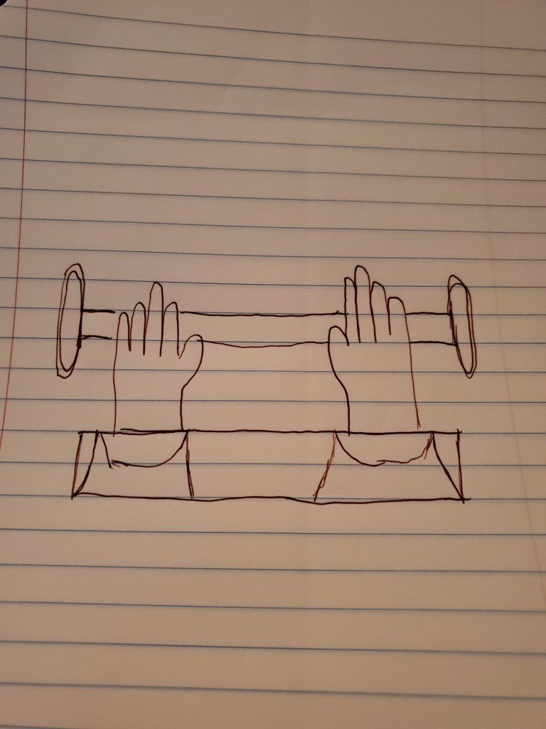
My idea is to have hands holding a straight bar that has weights on the bar with some kind of design surrounding or a banner underneath.
Illustrator Tutorials
Final Graphic Design
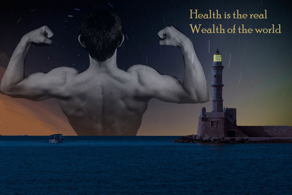
This is my final design for my graphic. I wanted to make a simple but impactful design that everyone could easily understand, I drew inspiration from looking at different kind of advertisements/posters online to get ideas of how pictures work together. Using the website sources provided to me for gathering pictures that are license free I began a search for health when I found the photo of the guy flexing I thought it was a perfect photo and started my search for photos that could be use as a scenery. This brought me to find the lighthouse noticing that it was greek design was a plus as I thought it could reinforce my topic of choice of health from the history of Greece. If nothing else I liked how a lighthouse could symbolize different things and had a multitude of uses. I ended up staying with the Aurora light trials for the background imagery I thought it was a good fit if I changed the lighthouse to be a night design rather than the day so that I could have another significant draw to the overall imagery.
I made the lighthouse look to be at night by using color look up in the photo shop menu of creating new fill or adjustment layer and then making a copy of a brighter version of the original so I could get the light. The most time consuming task was getting a good cut out of the man to be used after using the cut tool I went around and erased the extra off slowly and carefully. After editing the images I decided on the saying health is the real wealth of the world and positioned them in place that I thought had a good visibility and was distinct enough to act as a title. I then chose the color for the text so that it would blend and match in with the overall look.
I wanted a design that could be quickly discerned as a health related poster so that it could work as a introduction to my blog. The main focus being the man gives the main ideology of health being fitness to work with my topic choice.
Graphic design draft
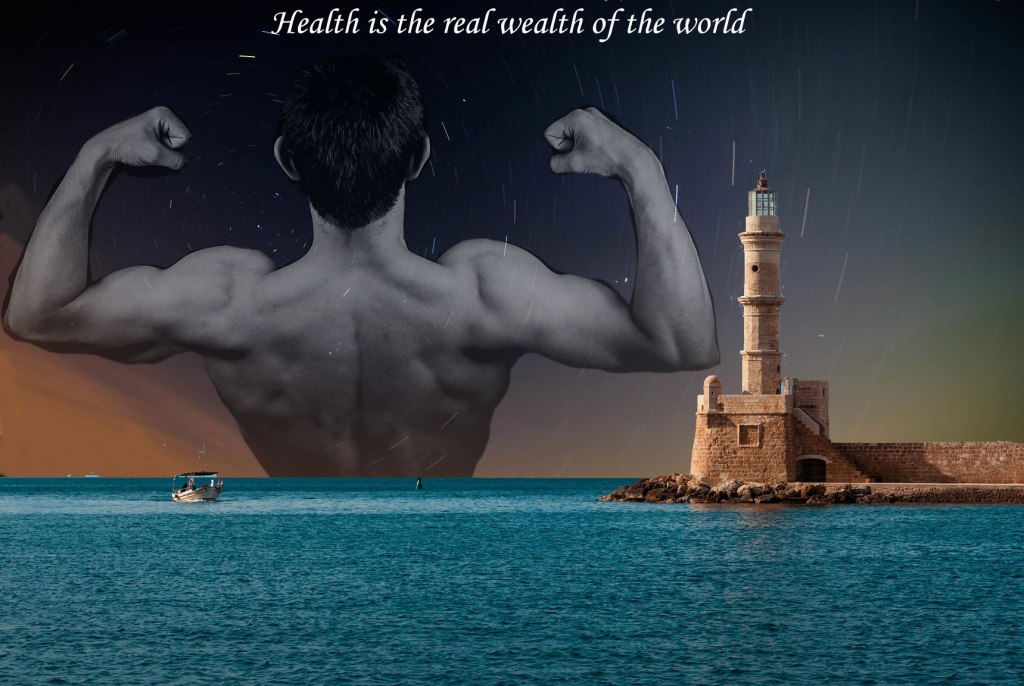
This is my draft of my cover photo for my blog I might need to blend the images better to have a nicer contrast. This is just a rough outline I started with the guy flexing and tried to find imagery that didn’t clash too much. I wanted to try to make something that stands out and portrays the idea of health might look into adding more of a health feel. I mainly followed the layer and cutting tutorial from the Photoshop tutorial last week. I combined a couple of images through layering. Some things could definitely be touched up the cutting tool didn’t work as intended and a lot of time was spent editing the cut photo. The images i selected I looked around for different scenery photos until I found a few that I liked and tested out a few to see how they look. The Lighthouse is from Greece something that is synonymous with athletics due to its history with creating the Olympics. The sky I just liked the look of and chose to include it I might try to find a more fitting sky so that their isn’t such a harsh contrast with night and day or even darken the lighthouse and sea. The quote I made is inspired by the Gandhi quote ” It is health that is real wealth and not pieces of gold and silver”.
Graphic design image collection
Photo from Flickr
Photo by Kyler Ortiz 
Photo by Cherrychill
Freeimage
My idea for the graphic design is to have an overview idea of what the blog will cover
Both images obtained online are public domain links provided in hyperlinks
Photoshop Tutorials
Here are my completed tutorials
Topic Choice
The topic that I chose is fitness. I chose this topic because fitness has always been something that I’ve been passionate about. This goes now more than ever since I am recovering from back surgery and being healthy is something that crosses my mind everyday. This topic will be easy to show photos, videos, and audio from myself; disclaimer I am not a certified trainer but will try to cite credible sources and show proper techniques. I will also talk with trainers that are available to get more incite on workouts. My idea for how to present my blog for viewing is to make a graphic that will give a basic idea of what the blog is about along with making videos of a routine workout. I am looking forward to share my experience with fitness and will try my best to provide accurate information for anyone who wants to try things out.
The websites below are things that might be helpful to people looking to get into working out or finding stretches to help you feel better. The top link is a research article that will show you the benefits as well has the harm stretches have for your body. For a more basic or rough starting point the second article lists some do’s and don’ts. One of the most important factors is that you don’t over due something and get hurt or use improper methods and put unnecessary strain on your body.
https://www.ncbi.nlm.nih.gov/pmc/articles/PMC3273886/
https://www.mayoclinic.org/healthy-lifestyle/fitness/in-depth/weight-training/art-20045842
My First Blog Post
Be yourself; Everyone else is already taken.
— Oscar Wilde.
This is the first post on my new blog. I’m just getting this new blog going, so stay tuned for more. Subscribe below to get notified when I post new updates.
