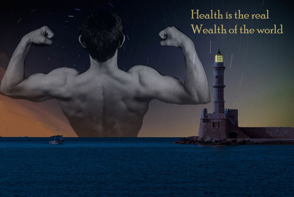
This is my final design for my graphic. I wanted to make a simple but impactful design that everyone could easily understand, I drew inspiration from looking at different kind of advertisements/posters online to get ideas of how pictures work together. Using the website sources provided to me for gathering pictures that are license free I began a search for health when I found the photo of the guy flexing I thought it was a perfect photo and started my search for photos that could be use as a scenery. This brought me to find the lighthouse noticing that it was greek design was a plus as I thought it could reinforce my topic of choice of health from the history of Greece. If nothing else I liked how a lighthouse could symbolize different things and had a multitude of uses. I ended up staying with the Aurora light trials for the background imagery I thought it was a good fit if I changed the lighthouse to be a night design rather than the day so that I could have another significant draw to the overall imagery.
I made the lighthouse look to be at night by using color look up in the photo shop menu of creating new fill or adjustment layer and then making a copy of a brighter version of the original so I could get the light. The most time consuming task was getting a good cut out of the man to be used after using the cut tool I went around and erased the extra off slowly and carefully. After editing the images I decided on the saying health is the real wealth of the world and positioned them in place that I thought had a good visibility and was distinct enough to act as a title. I then chose the color for the text so that it would blend and match in with the overall look.
I wanted a design that could be quickly discerned as a health related poster so that it could work as a introduction to my blog. The main focus being the man gives the main ideology of health being fitness to work with my topic choice.
